Localization Services Pages
Optimizing the digital experience for B2B language and localization services
Intro
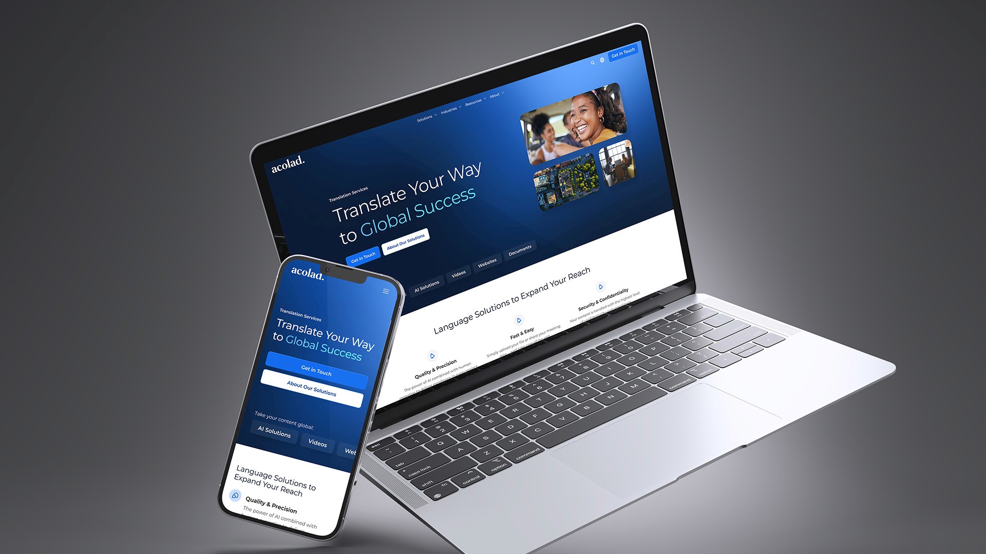
Acolad’s service and solution pages help procurement professionals and decision-makers at mid-to-large companies in Europe and North America learn about Acolad’s language and content localization services. These pages inform prospects and generate sales leads.
Team
Dragos Nicu, CMS Authoring
Radu Angelescu, Visual Design
Inês Pimentel, Copywriting
Amexio, Development
My Responsibilities
UX Design Lead
Visual Design
Wireframes
Research
Prototype
Content Populatation
Confusing in-page navigation
Problem
Through multiple high-speed acquisitions and brand consolidations, our product solution pages grew outdated, disorganized, and were not attracting the right visitors. They used legacy content, a patchwork of layouts and inherited tech, which made them difficult for users to navigate and find the information they needed. Internally, we needed a system that could support all of our solution types and generate leads—while working with minimal dev support available for implementation.
Goal
Redesign solution pages to be organized, informative, and attractive to the right visitors, with the goal of increasing lead conversion rates by 12%.


Insights
Ideation
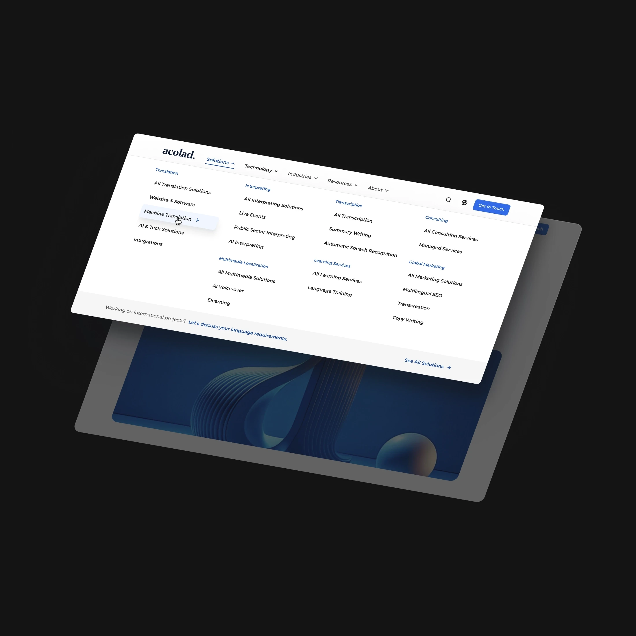
Simplify page architecture
As users get lost navigating across our different solutions and sub services, it may be easier for users to understand how to navigate if we reorganized our top solution pages into clearly defined pillars while clustering sub solutions and supporting content around each pillar.
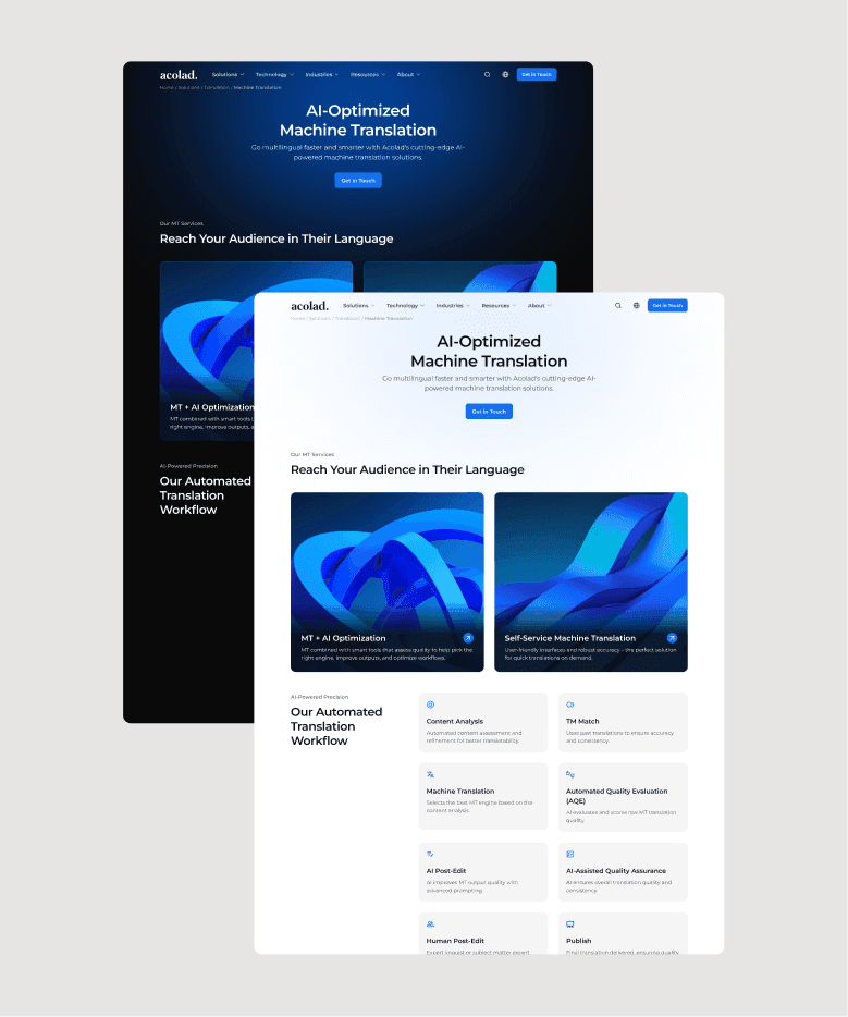
Clear and consistent page content
I created clear section divisions with distinct purposes and applied them consistently across all solution pages, resulting in a more organized and cohesive experience.
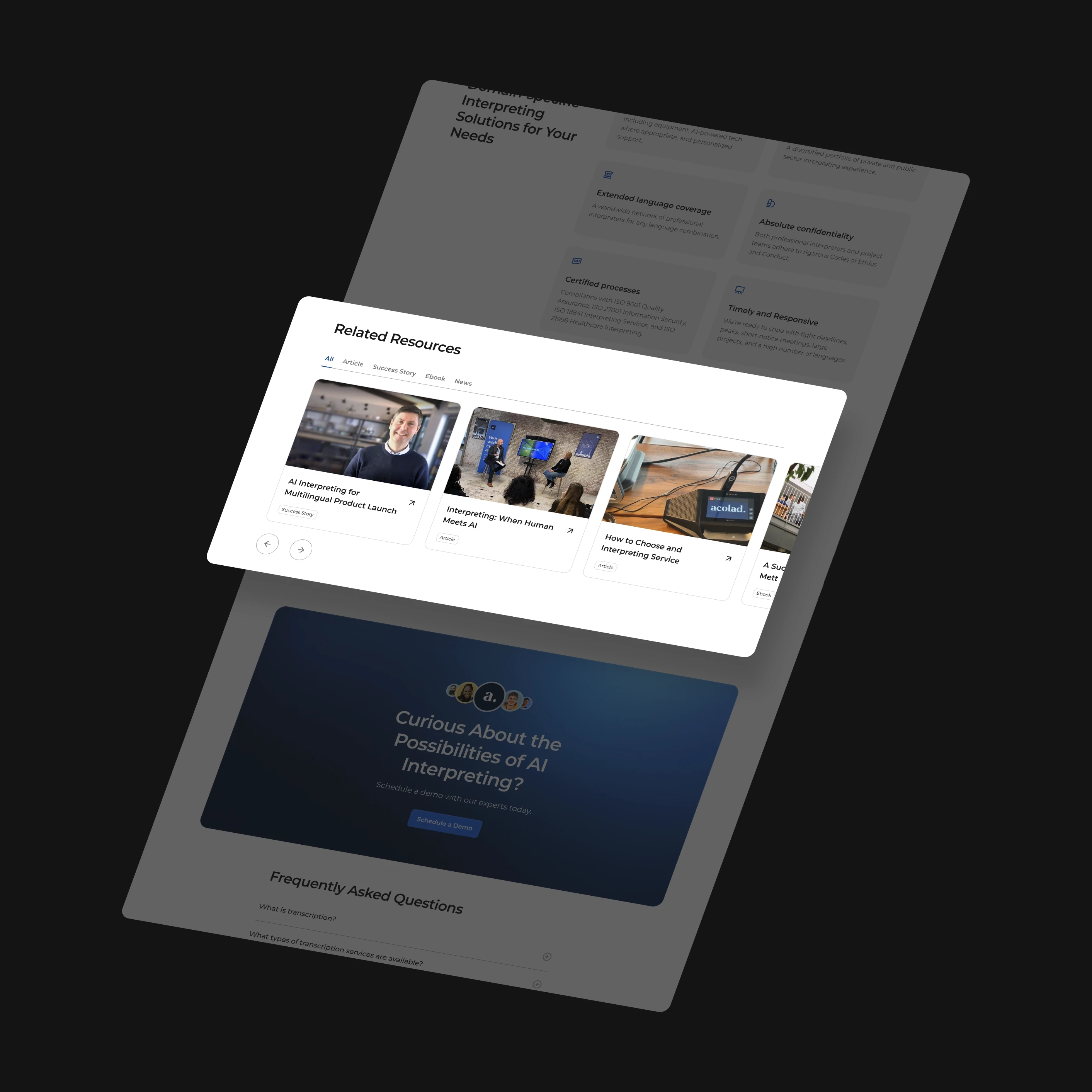
Bringing the right content forward
Related resources like case studies and blogs for anyone looking to dig deeper into a topic. Remove any older, less useful
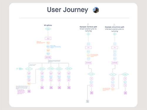
Wireframes + Low Fidelity Prototypes
To validate the user journey and page flow, I developed wireframes and conducted tests with internal users. These sessions helped identify usability issues, confirm intuitive flow, and collect valuable feedback to inform the next design iteration.

Accessibility
Multilingual
01
Layouts and content structures supported multilingual experiences, ensuring clarity and consistency across 12 supported languages.
Responsive Layout
02
Used a mobile-first approach with progressive enhancement to ensure layouts are accessible and usable across all screen sizes and devices.
Color + Contrast
03
Followed WCAG guidelines to apply accessible color palettes and contrast ratios, improving readability for users with visual impairments.
Screen Readers
04
Used semantic HTML and ARIA labels to ensure screen reader compatibility, enabling clear, structured navigation for non-visual users.
Results


— Acolad CEO
Takeaways
Working with limited access to real user data, I relied heavily on internal feedback to shape early decisions—highlighting the importance of testing assumptions. I gained deeper insight into the complexities of language management, especially how structure and flexibility must coexist in multilingual experiences. This project also reinforced the value of scalable design systems and cross-team alignment when balancing branding, UX, and localization needs.
© T.J. Besaw | Thank you for being here ✌️